The OmicsDI Home Page provides different blocks for navigating through the datasets, some of them
are: 2D WordCloud; the species/organism/diseases Bubble Chart, repository/omics Bar Chart, Latest Datasets List,
Most Accessed Datasets List, Datasets per year List. All the charts allow the user to search the data using
the specific attribute. These boxes also act as a statistic component of the resource: for example, the pie chart shows how many datasets
for each repository and omics the resource contains.
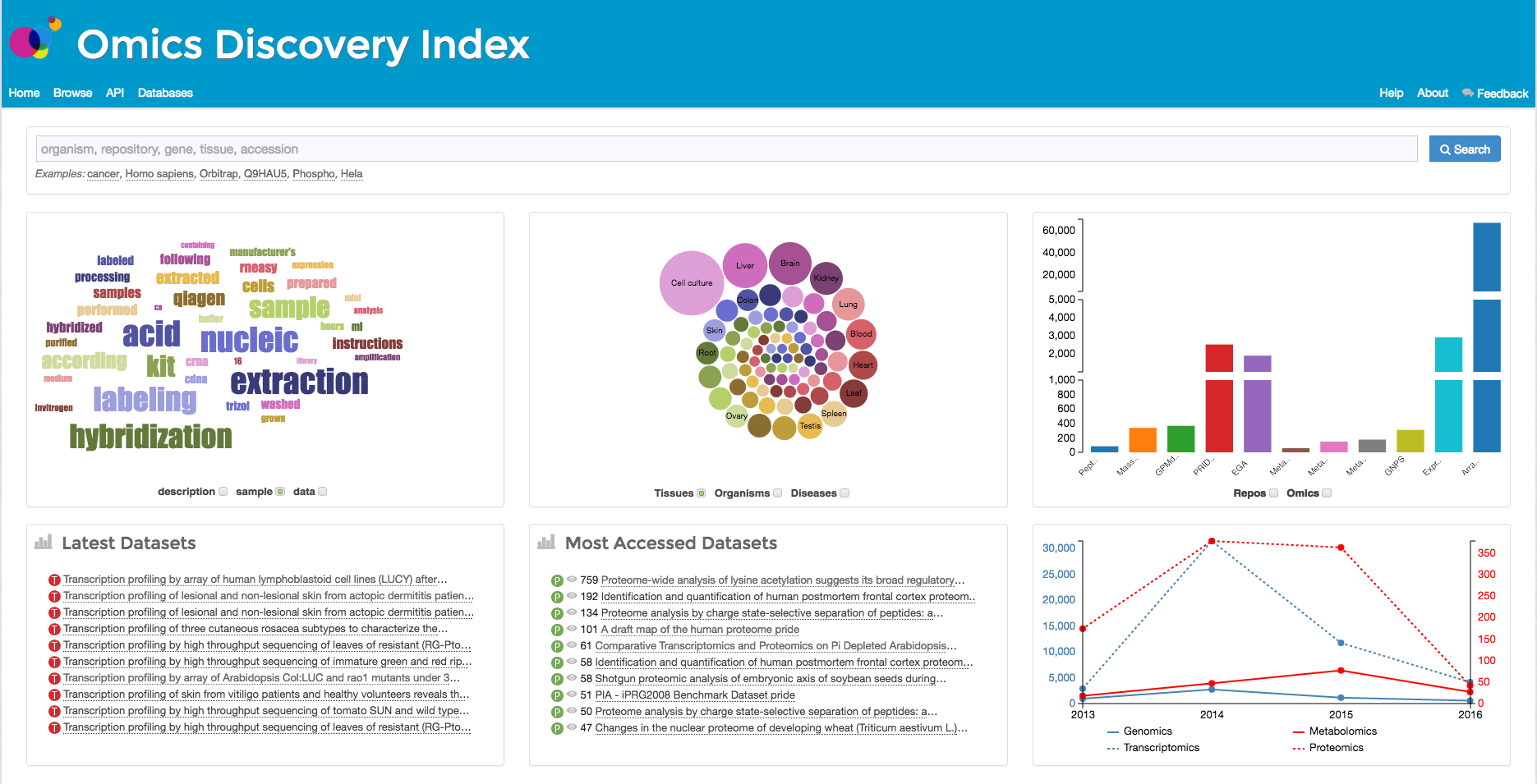
A TagCloud or WordCloud is a visual representation of metadata, typically used to depict keyword metadata (tags)
on datasets, or to visualize free form text. The WordCloud is built using the more frequent words for every
database/repository. The OmicsDI WordCloud can be considered as a two-dimensional term representation where the user can
select the database and the field they want to look for: description vs database. The user can click the highlighted word in
the wordcloud to search for this term in the resource.
The Bubble Chart block allows the users to navigate the data using three main categories: Tissues, Organisms,
and Diseases. The user can click on the bubble and s/he will be redirected to the search using the clicked term.
The Repo/Omics Bar Chart and the Omics vs Year bar chart allow the users navigate the data using the omics categories
(metabolomics, transcriptomics, proteomics and genomics). The user can click a bar or the pie and it will
be redirected to the search using the clicked term.
The Latest Datasets and Most accessed datasets blocks provide a list of the datasets by the two categories.